 Design System · F. Store Visual
Design System · F. Store Visual
Design System · F. Store Visual
Store Visual · 门店视觉规范
门店是体系里最大的一块「印刷品」:原木格栅做骨、面粉白做纸、绛红做印、暖光金字做识别。本页规范五个触点——门头横招、竖招、灯箱菜单牌、档口现包展示区、外摆——并附 AI 生图对齐说明,保证每一张效果图和每一家真实门店都长在同一套语言上。
01 · Materials 材质与用色
竖向格栅 40×60mm、间距 40mm;哑光清漆,禁高光漆与深色染色。
对齐 #FCFBF8;哑光乳胶漆或微水泥,禁瓷砖亮面反光。
每个立面只出现一处绛红实体(灯箱条/圆印/招贴),面积 ≤5%。
发光字 3000K 暖白;金色仅做字与细线,禁金色铺面。
02 · Touchpoints 五个触点
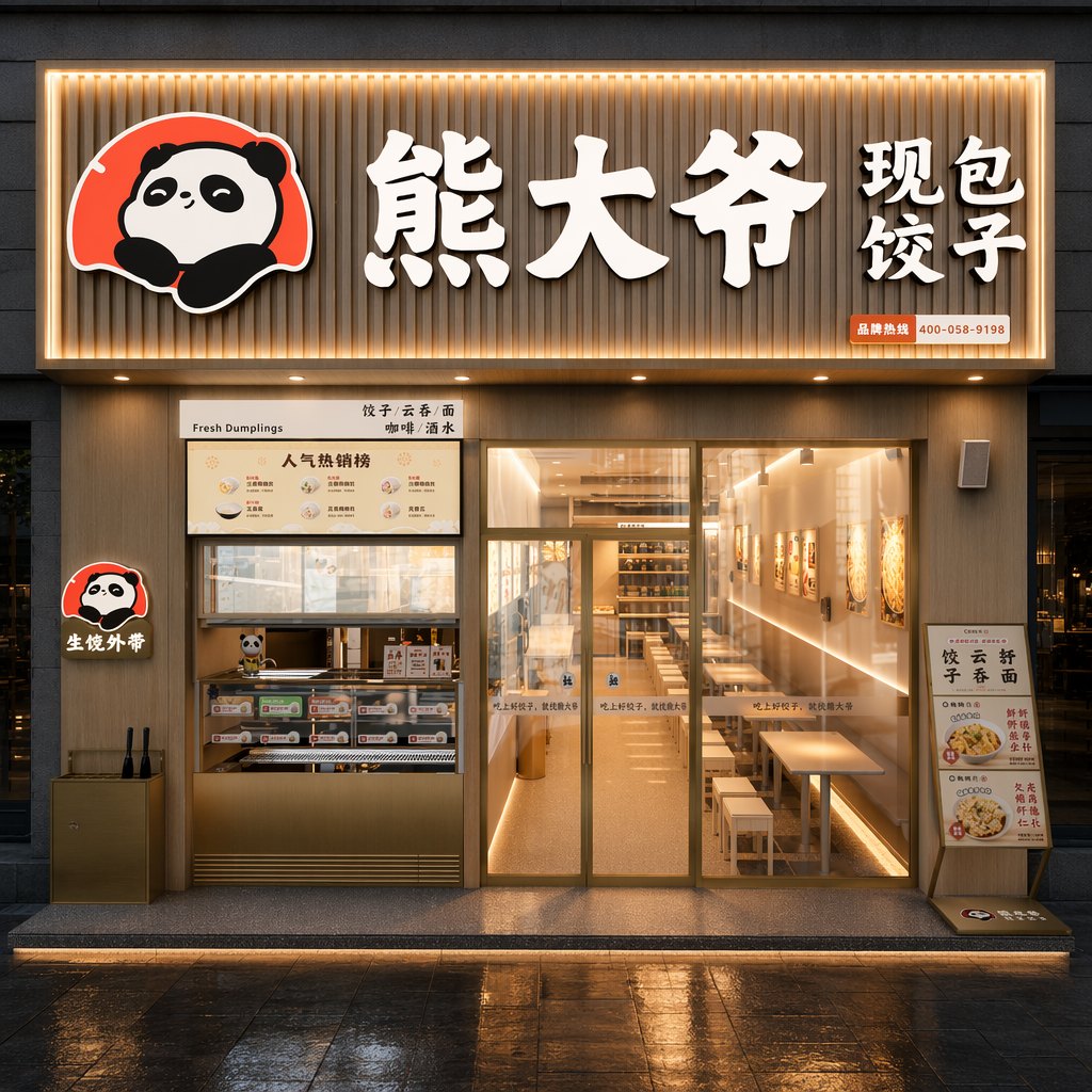
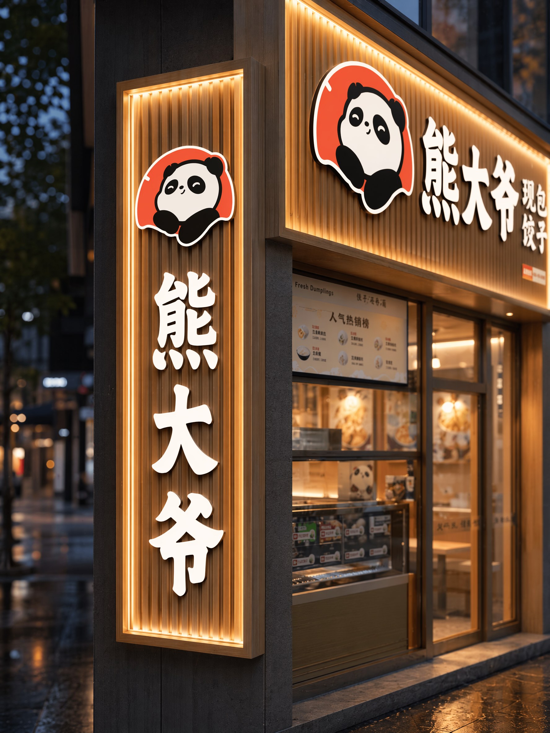
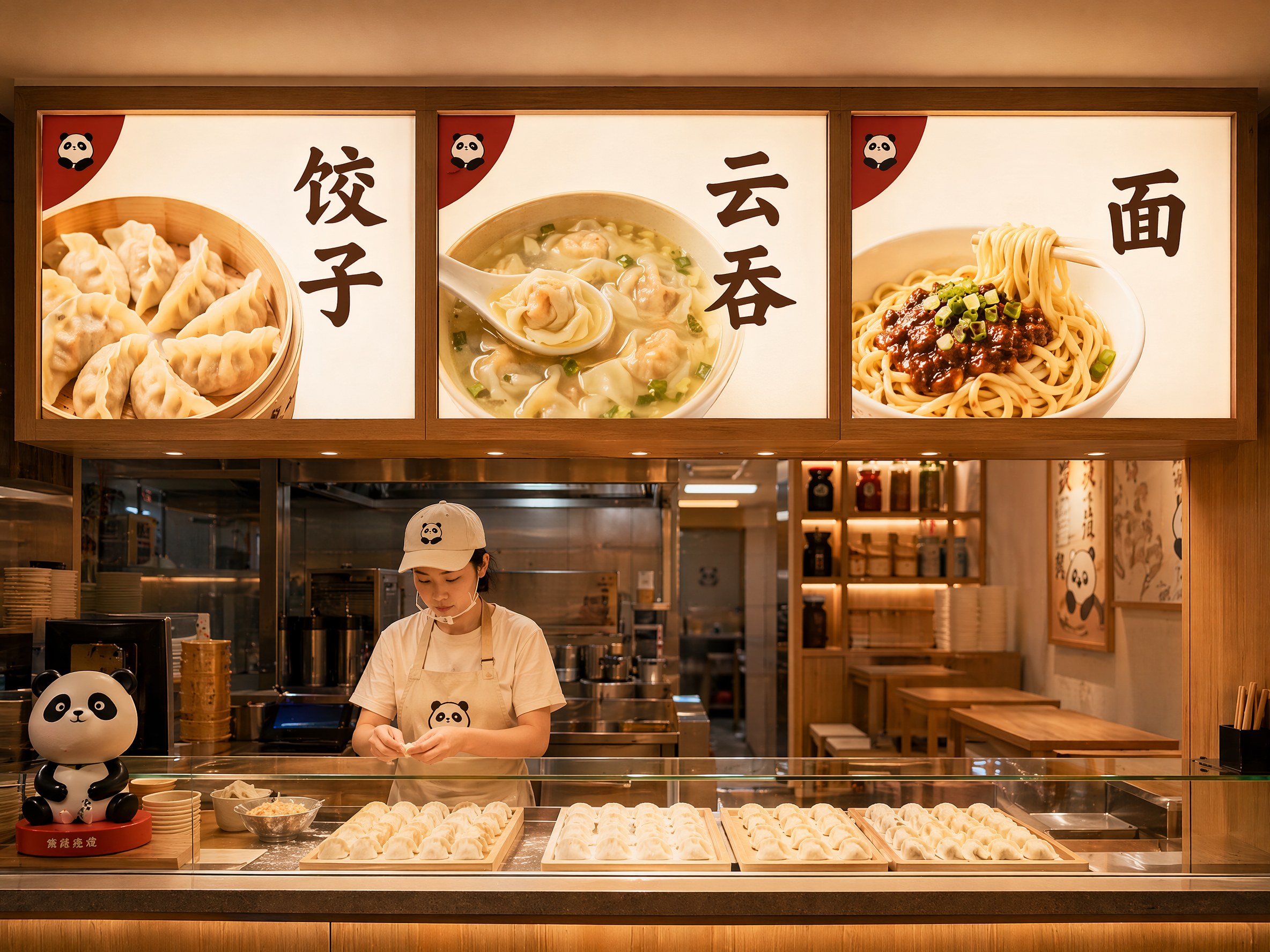
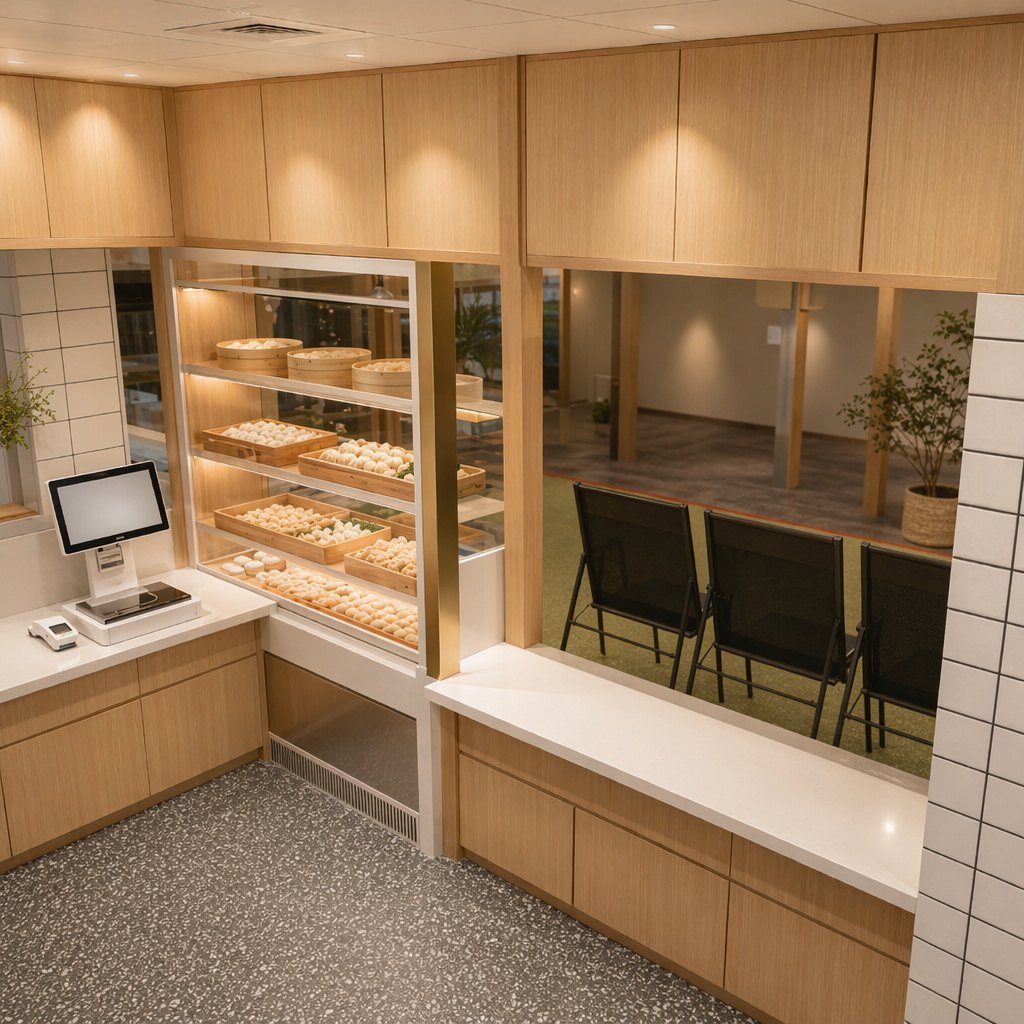
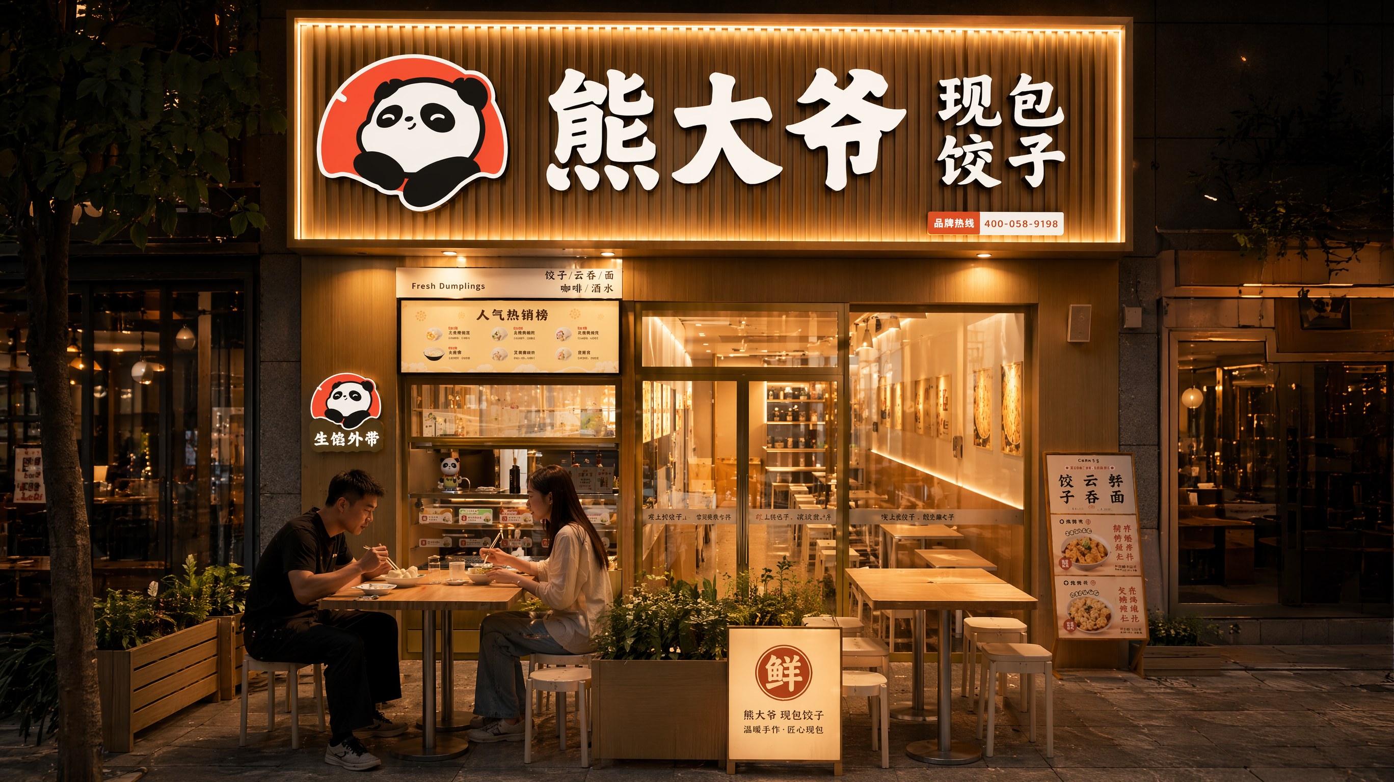
03 · AI Render Guide 生图对齐说明
--reference_images 真实门头照 URL(招牌一致性锚点)
"... matching the reference brand storefront: wood-slat facade, warm 3000K glow, panda logo and Chinese characters identical to reference, do not invent or alter text. [场景描述]. Crescent Chinese jiaozi dumplings with pleats, STRICTLY NOT baozi, no round topknot. Steam only from real hot food. Premium brand documentary style, warm color grade, shallow depth of field. No invented text."